
Chart (31)
C#: Create Charts in PowerPoint Slides with Excel Data
2024-08-19 01:08:29 Written by support iceblueCreating charts in PowerPoint slides is a powerful way to enhance presentations by visually representing complex information, making it easier for audiences to grasp key insights. By reading Excel data directly to generate charts, you can streamline the data entry process and ensure data accuracy. Or, if you want to use charts from Excel files directly in PowerPoint presentations, you can directly insert them as pictures into PowerPoint slides, thus maximizing the original formatting and appearance. This article will show how to create charts in PowerPoint slides from Excel data using Spire.Office for .NET in .NET programs.
- Create Charts in PowerPoint Slides with Excel Data using C#
- Insert Excel Charts into PowerPoint Slides as Images using C#
Install Spire.Office for .NET
To begin with, you need to add the DLL files included in the Spire.Office for.NET package as references in your .NET project. The DLL files can be either downloaded from this link or installed via NuGet.
PM> Install-Package Spire.Office
Create Charts in PowerPoint Slides with Excel Data using C#
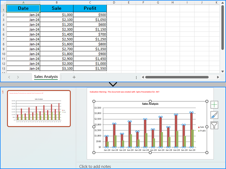
Developers can read data from Excel worksheets with Spire.XLS for .NET and then create charts in PowerPoint slides with Spire.Presentation for .NET using the read data as the charts' data source. The detailed steps for creating charts in PowerPoint presentations with Excel file data are as follows:
- Create an instance of Presentation class.
- Create an instance of Workbook class and load an Excel file using Workbook.LoadFromFile() method.
- Get the first slide in the presentation through Presentation.Slides[] property and create a chart in the first slide of the presentation using ISlide.Shapes.AppendChart() method.
- Clear the default dummy data using IChart.ChartData.Clear() method.
- Get the first worksheet in the workbook through Workbook.Worksheets[] property.
- Iterate through rows in the worksheet and then the columns in the worksheet:
- Get the cell values in the worksheet through Worksheet.AllocatedRange[].Value2 property and set them as the values of the chart’s data through IChart.ChartData[].Value property.
- Set the chart title using properties under IChart.ChartTitle property.
- Set the chart series labels and category labels through IChart.Series.SeriesLabel and IChart.Categories.CategoryLabels properties.
- Set the series values through IChart.Series[].Values property.
- Set the number format of the axis through IChart.PrimaryCategoryAxis.NumberFormat and IChart.PrimaryValueAxis.NumberFormat properties.
- Set the style of the chart through IChart.ChartStyle property.
- Save the presentation using Presentation.SaveToFile() method.
- C#
using Spire.Presentation;
using Spire.Presentation.Charts;
using Spire.Xls;
using System.Drawing;
using FileFormat = Spire.Presentation.FileFormat;
using IChart = Spire.Presentation.Charts.IChart;

namespace PresentationChartExcelData
{
    class Program
    {
        public static void Main(string[] args)
        {
            // Create an instance of Presentation class
            Presentation presentation = new Presentation();

            // Set the slide size
            presentation.SlideSize.Type = SlideSizeType.Screen16x9;

            // Create an instance of Workbook class and load an Excel file
            Workbook workbook = new Workbook();
            workbook.LoadFromFile("Sample.xlsx");

            // Get the first worksheet in the workbook
            Worksheet sheet = workbook.Worksheets[0];

            // Create a chart in the presentation
            RectangleF rect = new RectangleF(50, 100, presentation.SlideSize.Size.Width - 100, presentation.SlideSize.Size.Height - 150);
            ISlide slide = presentation.Slides[0];
            IChart chart = slide.Shapes.AppendChart(ChartType.ColumnClustered, rect);

            // Clear the default dummy data
            chart.ChartData.Clear(0, 0, 5, 5);

            // Iterate through the rows in the worksheet
            for (int i = 0; i < sheet.AllocatedRange.RowCount; i++)
            {
                // Iterate through the columns in the worksheet
                for (int j = 0; j < sheet.AllocatedRange.ColumnCount; j++)
                {
                    // Set the cell values in the worksheet as the values of the chart data
                    chart.ChartData[i, j].Value = sheet.AllocatedRange[i + 1, j + 1].Value2;
                    // Copy number formats
                    chart.ChartData[i, j].NumberFormat = sheet.AllocatedRange[i + 1, j + 1].NumberFormat;
                }
            }

            // Set the chart title
            chart.ChartTitle.TextProperties.Text = sheet.Name;
            chart.ChartTitle.TextProperties.IsCentered = true;
            chart.ChartTitle.Height = 25;
            chart.HasTitle = true;

            // Set the series labels and category labels
            chart.Series.SeriesLabel = chart.ChartData["B1", "C1"];
            chart.Categories.CategoryLabels = chart.ChartData["A2", "A" + sheet.AllocatedRange.RowCount];

            // Set the series values
            chart.Series[0].Values = chart.ChartData["B2", "B" + sheet.AllocatedRange.RowCount];
            chart.Series[1].Values = chart.ChartData["C2", "C" + sheet.AllocatedRange.RowCount];

            // Set the number format of the axis
            chart.PrimaryCategoryAxis.NumberFormat = sheet.AllocatedRange["A2"].NumberFormat;
            chart.PrimaryValueAxis.NumberFormat = sheet.AllocatedRange["B2"].NumberFormat;

            // Set the style of the chart
            chart.ChartStyle = ChartStyle.Style2;

            // Set the overlap and gap width
            chart.OverLap = 50;
            chart.GapWidth = 200;

            // Save the presentation
            presentation.SaveToFile("output/PresentationChartExcelData.pptx", FileFormat.Pptx2019);
            presentation.Dispose();
            workbook.Dispose();
        }
    }
}
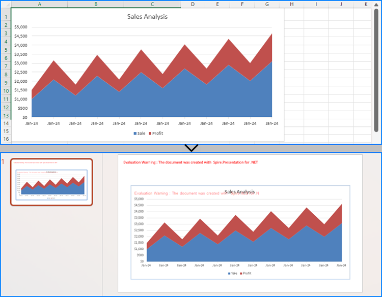
Insert Excel Charts into PowerPoint Slides as Images using C#
To insert an existing chart from an Excel worksheet into a PowerPoint slide while maintaining its appearance and formatting precisely, the Workbook.SaveChartAsImage() method can be employed. This method allows the Excel chart to be saved as an image, which can then be added to the slide. The specific steps are as follows:
- Create an instance of Presentation class.
- Create an instance of Workbook class and load an Excel file using Workbook.LoadFromFile() method.
- Save a chart in a worksheet as an image using Workbook.SaveChartAsImage() method.
- Embed the image into the presentation using Presentation.Images.Append() method.
- Add the image to a slide using Presentation.Slides[].AppendEmbedImage() method.
- Save the presentation using Presentation.SaveToFile() method.
- C#
using Spire.Presentation;
using Spire.Presentation.Drawing;
using Spire.Xls;
using System.Drawing;
using FileFormat = Spire.Presentation.FileFormat;

namespace PresentationChartExcelChart
{
    class Program
    {
        public static void Main(string[] args)
        {
            // Create an instance of Presentation class
            Presentation presentation = new Presentation();

            // Set the slide size
            presentation.SlideSize.Type = SlideSizeType.Screen16x9;

            // Create an instance of Workbook class and load an Excel file
            Workbook workbook = new Workbook();
            workbook.LoadFromFile("Sample.xlsx");

            // Save the first chart in the first worksheet as an image
            Image image = workbook.SaveChartAsImage(workbook.Worksheets[0], 0);

            // Embed the image into the presentation
            IImageData imageData = presentation.Images.Append(image);

            // Add the image to the first slide
            RectangleF rect = new RectangleF(50, 120, presentation.SlideSize.Size.Width - 100, presentation.SlideSize.Size.Height - 170);
            presentation.Slides[0].Shapes.AppendEmbedImage(ShapeType.Rectangle, imageData, rect);

            // Save the presentation
            presentation.SaveToFile("output/PresentationChartExcelChart.pptx", FileFormat.Pptx2019);
            presentation.Dispose();
            workbook.Dispose();
        }
    }
}
Apply for a Temporary License
If you'd like to remove the evaluation message from the generated documents, or to get rid of the function limitations, please request a 30-day trial license for yourself.
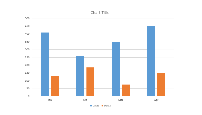
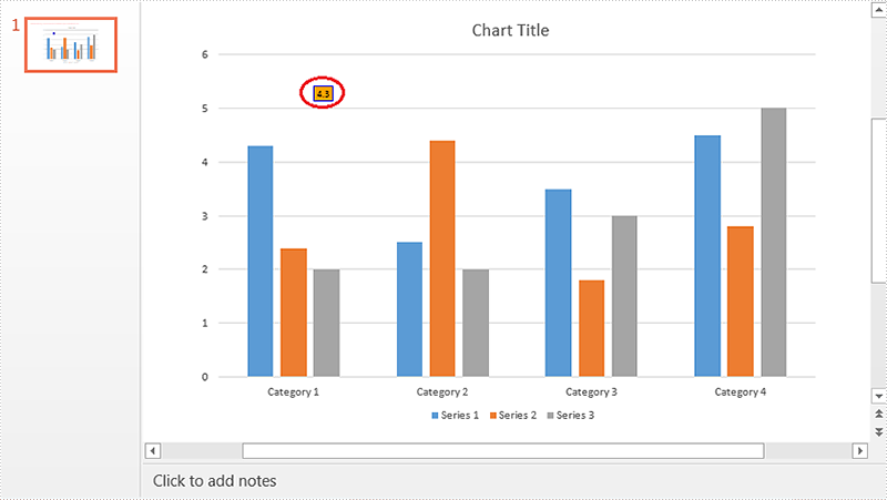
Spire.Presentation provides a property "IsHidden" to enable developers to hide or show a specific series of a chart. This article demonstrates how we can accomplish this function using Spire.Presentation and C#.
Below is the screenshot of the original chart:
Detail steps:
Step 1: Instantiate a Presentation object and load the PowerPoint file.
Presentation ppt = new Presentation();
ppt.LoadFromFile("Input.pptx");
Step 2: Get the first slide.
ISlide slide = ppt.Slides[0];
Step 3: Get the first chart.
IChart chart = slide.Shapes[0] as IChart;
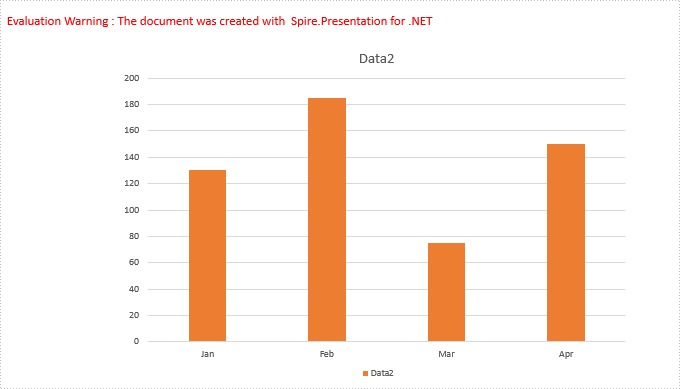
Step 4: Hide the first series of the chart.
//Hide the first series of the chart
chart.Series[0].IsHidden = true;

//Show the first series of the chart
//chart.Series[0].IsHidden = false;
Step 5: Save the file.
ppt.SaveToFile("Output.pptx", FileFormat.Pptx2013);
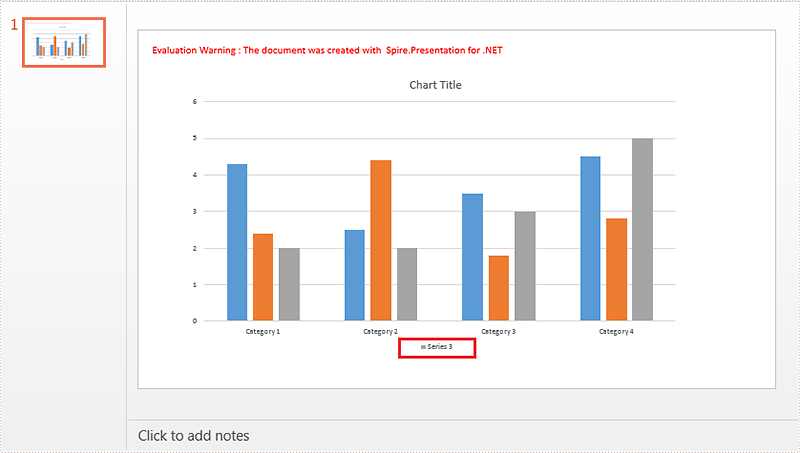
Screenshot after hiding the first series:
using Spire.Presentation;
using Spire.Presentation.Charts;

namespace Hide_Chart_Series_in_PPT
{
    class Program
    {
        static void Main(string[] args)
        {
            //Instantiate a Presentation object
            Presentation ppt = new Presentation();
            //Load the PowerPoint file
            ppt.LoadFromFile("Input.pptx");

            //Get the first slide
            ISlide slide = ppt.Slides[0];

            //Get the first chart
            IChart chart = slide.Shapes[0] as IChart;

            //Hide the first series of the chart
            chart.Series[0].IsHidden = true;

            //Show the first series of the chart
            //chart.Series[0].IsHidden = false;

            //Save the file
            ppt.SaveToFile("Output.pptx", FileFormat.Pptx2013);
        }
    }
}
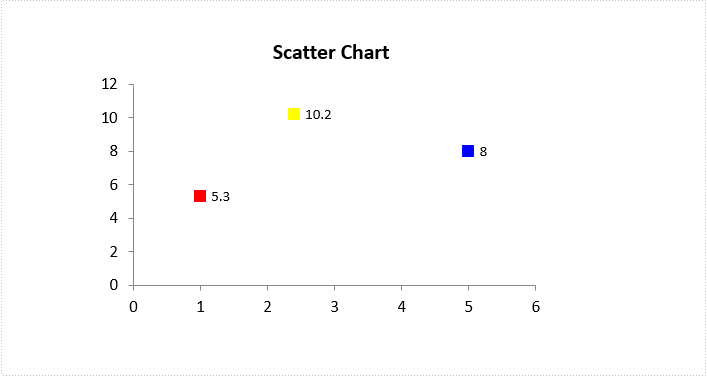
Vary the Colors of Same-series Data Markers in a Chart in C#, VB.NET
2018-06-12 06:38:00 Written by support iceblueIf you have a line, (xy) scatter, or radar chart, you can change the look of the data markers to make them easier to distinguish. In this article, you will learn how to set different colors for different data markers, by using Spire.Presentation with C# and VB.NET.
Step 1: Load a sample PowerPoint file.
Presentation ppt = new Presentation();
ppt.LoadFromFile("ScatterChart.pptx");
Step 2: Get the chart from the presentation.
IChart chart = ppt.Slides[0].Shapes[0] as IChart;
Step 3: Create a ChartDataPoint object and specify the index.
ChartDataPoint dataPoint = new ChartDataPoint(chart.Series[0]);
dataPoint.Index = 0;
Step 4: Set the fill color of the data marker.
dataPoint.MarkerFill.Fill.FillType = FillFormatType.Solid;
dataPoint.MarkerFill.Fill.SolidColor.Color = Color.Red;
Step 5: Set the line color of the data marker.
dataPoint.MarkerFill.Line.FillType = FillFormatType.Solid;
dataPoint.MarkerFill.Line.SolidFillColor.Color = Color.Red;
Step 6: Add the data point to the point collection of a series.
chart.Series[0].DataPoints.Add(dataPoint);
Step 7: Save to file.
ppt.SaveToFile("result.pptx", FileFormat.Pptx2010);
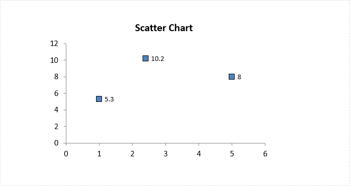
Source File:
Result:
Full Code:
Presentation ppt = new Presentation();
ppt.LoadFromFile("ScatterChart.pptx");
IChart chart = ppt.Slides[0].Shapes[0] as IChart;

ChartDataPoint dataPoint = new ChartDataPoint(chart.Series[0]);
dataPoint.Index = 0;
dataPoint.MarkerFill.Fill.FillType = FillFormatType.Solid;
dataPoint.MarkerFill.Fill.SolidColor.Color = Color.Red;
dataPoint.MarkerFill.Line.FillType = FillFormatType.Solid;
dataPoint.MarkerFill.Line.SolidFillColor.Color = Color.Red;
chart.Series[0].DataPoints.Add(dataPoint);

dataPoint = new ChartDataPoint(chart.Series[0]);
dataPoint.Index = 1;
dataPoint.MarkerFill.Fill.FillType = FillFormatType.Solid;
dataPoint.MarkerFill.Fill.SolidColor.Color = Color.Yellow;
dataPoint.MarkerFill.Line.FillType = FillFormatType.Solid;
dataPoint.MarkerFill.Line.SolidFillColor.Color = Color.Yellow;
chart.Series[0].DataPoints.Add(dataPoint);

dataPoint = new ChartDataPoint(chart.Series[0]);
dataPoint.Index = 2;
dataPoint.MarkerFill.Fill.FillType = FillFormatType.Solid;
dataPoint.MarkerFill.Fill.SolidColor.Color = Color.Blue;
dataPoint.MarkerFill.Line.FillType = FillFormatType.Solid;
dataPoint.MarkerFill.Line.SolidFillColor.Color = Color.Blue;
chart.Series[0].DataPoints.Add(dataPoint);

ppt.SaveToFile("result.pptx", FileFormat.Pptx2010);
using Spire.Presentation;
using Spire.Presentation.Charts;
using Spire.Presentation.Drawing;
using System.Drawing;

namespace VaryColor
{
    class Program
    {
        static void Main(string[] args)
        {
            Presentation ppt = new Presentation();
            ppt.LoadFromFile("ScatterChart.pptx");
            IChart chart = ppt.Slides[0].Shapes[0] as IChart;

            ChartDataPoint dataPoint = new ChartDataPoint(chart.Series[0]);
            dataPoint.Index = 0;
            dataPoint.MarkerFill.Fill.FillType = FillFormatType.Solid;
            dataPoint.MarkerFill.Fill.SolidColor.Color = Color.Red;
            dataPoint.MarkerFill.Line.FillType = FillFormatType.Solid;
            dataPoint.MarkerFill.Line.SolidFillColor.Color = Color.Red;
            chart.Series[0].DataPoints.Add(dataPoint);

            dataPoint = new ChartDataPoint(chart.Series[0]);
            dataPoint.Index = 1;
            dataPoint.MarkerFill.Fill.FillType = FillFormatType.Solid;
            dataPoint.MarkerFill.Fill.SolidColor.Color = Color.Yellow;
            dataPoint.MarkerFill.Line.FillType = FillFormatType.Solid;
            dataPoint.MarkerFill.Line.SolidFillColor.Color = Color.Yellow;
            chart.Series[0].DataPoints.Add(dataPoint);

            dataPoint = new ChartDataPoint(chart.Series[0]);
            dataPoint.Index = 2;
            dataPoint.MarkerFill.Fill.FillType = FillFormatType.Solid;
            dataPoint.MarkerFill.Fill.SolidColor.Color = Color.Blue;
            dataPoint.MarkerFill.Line.FillType = FillFormatType.Solid;
            dataPoint.MarkerFill.Line.SolidFillColor.Color = Color.Blue;
            chart.Series[0].DataPoints.Add(dataPoint);

            ppt.SaveToFile("result.pptx", FileFormat.Pptx2010);
        }
    }
}
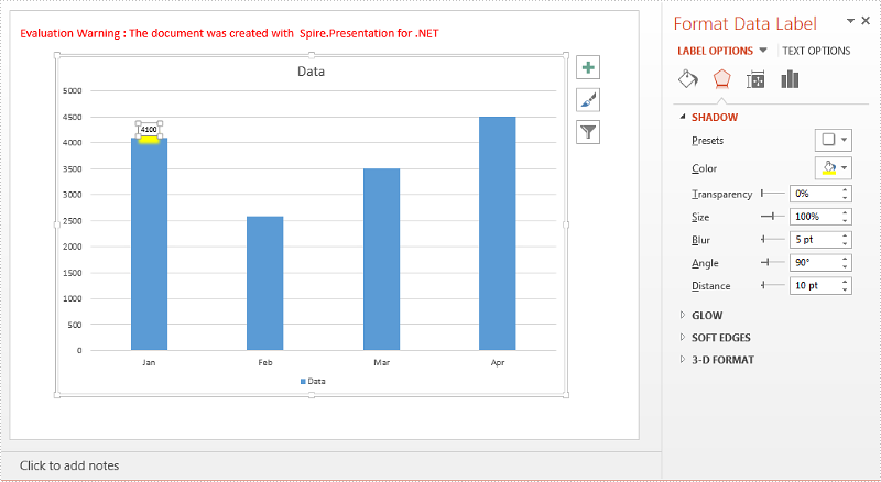
Add Shadow Effect to Chart DataLabels in PowerPoint in C#
2018-05-15 08:16:46 Written by support iceblueAdding shadow effect is one of the good ways to make a data label stand out on your chart. This article is going to show you how to add shadow effect to a chart data label in PowerPoint using Spire.Presentation.
Detail steps:
Step 1: Initialize a Presentation object and load the PowerPoint file.
Presentation ppt = new Presentation();
ppt.LoadFromFile(@"test.pptx");
Step 2: Get the chart.
IChart chart = ppt.Slides[0].Shapes[0] as IChart;
Step 3: Add a data label to the first chart series.
ChartDataLabelCollection dataLabels = chart.Series[0].DataLabels;
ChartDataLabel Label = dataLabels.Add();
Label.LabelValueVisible = true;
Step 4: Add outer shadow effect to the data label.
Label.Effect.OuterShadowEffect = new OuterShadowEffect();
//Set shadow color
Label.Effect.OuterShadowEffect.ColorFormat.Color = Color.Yellow;
//Set blur
Label.Effect.OuterShadowEffect.BlurRadius = 5;
//Set distance
Label.Effect.OuterShadowEffect.Distance = 10;
//Set angle
Label.Effect.OuterShadowEffect.Direction = 90f;
Step 5: Save the file.
ppt.SaveToFile("Shadow.pptx", FileFormat.Pptx2010);
Screenshot:
Full code:
using System.Drawing;
using Spire.Presentation;
using Spire.Presentation.Charts;
using Spire.Presentation.Collections;
using Spire.Presentation.Drawing;

namespace Add_Shadow_Effect_to_Chart_Datalabel
{
    class Program
    {
        static void Main(string[] args)
        {
            //Initialize a Presentation object
            Presentation ppt = new Presentation();
            //Load the PowerPoint file
            ppt.LoadFromFile(@"test.pptx");

            //Get the chart
            IChart chart = ppt.Slides[0].Shapes[0] as IChart;

            //Add a data label to the first chart series
            ChartDataLabelCollection dataLabels = chart.Series[0].DataLabels;
            ChartDataLabel Label = dataLabels.Add();
            Label.LabelValueVisible = true;

            //Add outer shadow effect to the data label

            Label.Effect.OuterShadowEffect = new OuterShadowEffect();
            //Set shadow color
            Label.Effect.OuterShadowEffect.ColorFormat.Color = Color.Yellow;
            //Set blur
            Label.Effect.OuterShadowEffect.BlurRadius = 5;
            //Set distance
            Label.Effect.OuterShadowEffect.Distance = 10;
            //Set angle
            Label.Effect.OuterShadowEffect.Direction = 90f;

            //Save the file
            ppt.SaveToFile("Shadow.pptx", FileFormat.Pptx2010);
        }
    }
}
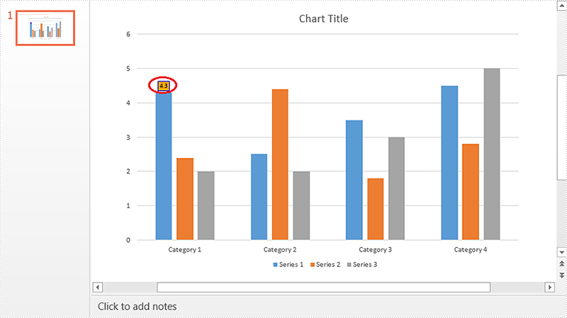
Set Position of Chart Data Labels in PowerPoint in C#
2018-04-13 08:00:45 Written by support iceblueSpire.Presentation supports to set the default position (e.g. Outside End, Center, Inside End, Inside base etc.) of data labels through ChartDataLabel.Position property, it also supports to set custom position of data labels using "ChartDataLabel.X" and "ChartDataLabel.Y" properties. This article is going to elaborate how we can set default and custom position of data labels using Spire.Presentation.
Detail steps:
Step 1: Initialize a Presentation object and load the PowerPoint file.
Presentation ppt = new Presentation();
ppt.LoadFromFile(@"Input.pptx");
Step 2: Get the chart.
IChart chart = ppt.Slides[0].Shapes[0] as IChart;
Step 3: Add data label to the chart and set its id.
ChartDataLabel label1 = chart.Series[0].DataLabels.Add();
label1.ID = 0;
Step 4: Set the position of data label.
//Set the default position of data label. This position is relative to the data markers.
//label1.Position = ChartDataLabelPosition.OutsideEnd;

//Set custom position of data label. This position is relative to the default position.
label1.X = 0.1f;
label1.Y = -0.1f;
Step 5: Set the properties of data label.
//Set label value visible
label1.LabelValueVisible = true;
//Set legend key invisible
label1.LegendKeyVisible = false;
//Set category name invisible
label1.CategoryNameVisible = false;
//Set series name invisible
label1.SeriesNameVisible = false;
//Set Percentage invisible
label1.PercentageVisible = false;

//Set border style and fill style of data label
label1.Line.FillType = Spire.Presentation.Drawing.FillFormatType.Solid;
label1.Line.SolidFillColor.Color = Color.Blue;
label1.Fill.FillType = Spire.Presentation.Drawing.FillFormatType.Solid;
label1.Fill.SolidColor.Color = Color.Orange;
Step 6: Save the file.
ppt.SaveToFile(@"Output.pptx", FileFormat.Pptx2013);
Screenshot:
Default position (Outside End):
Custom position:
Full code:
using Spire.Presentation;
using Spire.Presentation.Charts;
using System.Drawing;

namespace Set_Position_of_Chart_Data_Label_in_PPT
{
    class Program
    {
        static void Main(string[] args)
        {
            //Initialize a Presentation object
            Presentation ppt = new Presentation();
            //Load the PowerPoint file
            ppt.LoadFromFile(@"Input.pptx");

            //Get the chart
            IChart chart = ppt.Slides[0].Shapes[0] as IChart;

            //Add data label to chart and set its id
            ChartDataLabel label1 = chart.Series[0].DataLabels.Add();
            label1.ID = 0;

            //Set the default position of data label. This position is relative to the data markers.
            //label1.Position = ChartDataLabelPosition.OutsideEnd;

            //Set custom position of data label. This position is relative to the default position.
            label1.X = 0.1f;
            label1.Y = -0.1f;

            //Set label value visible
            label1.LabelValueVisible = true;
            //Set legend key invisible
            label1.LegendKeyVisible = false;
            //Set category name invisible
            label1.CategoryNameVisible = false;
            //Set series name invisible
            label1.SeriesNameVisible = false;
            //Set Percentage invisible
            label1.PercentageVisible = false;

            //Set border style and fill style of data label
            label1.Line.FillType = Spire.Presentation.Drawing.FillFormatType.Solid;
            label1.Line.SolidFillColor.Color = Color.Blue;
            label1.Fill.FillType = Spire.Presentation.Drawing.FillFormatType.Solid;
            label1.Fill.SolidColor.Color = Color.Orange;

            //Save the file
            ppt.SaveToFile(@"Output.pptx", FileFormat.Pptx2013);
        }
    }
}
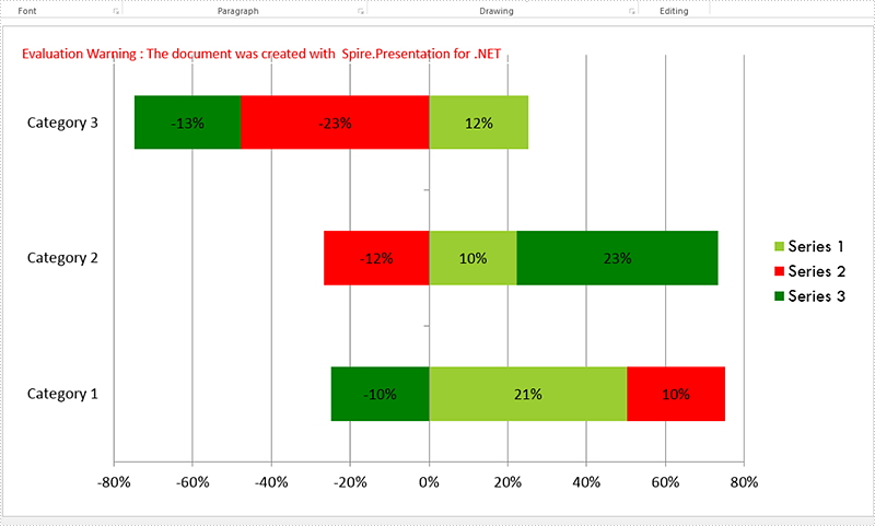
A 100% stacked bar chart is a chart type designed to show the relative percentage of multiple data series in stacked bars, where the total of each stacked bar always equals 100%. This article will demonstrate how to use Spire.Presentation to create 100% stacked bar in PowerPoint in C#.
Step 1: Create a Presentation object.
Presentation presentation = new Presentation();
Step 2: Add a "Bar100PercentStacked" chart to the first slide.
presentation.SlideSize.Type = SlideSizeType.Screen16x9;
SizeF slidesize = presentation.SlideSize.Size;
var slide = presentation.Slides[0];

RectangleF rect = new RectangleF(20, 20, slidesize.Width - 40, slidesize.Height - 40);
IChart chart = slide.Shapes.AppendChart(Spire.Presentation.Charts.ChartType.Bar100PercentStacked, rect);
Step 3: Write data to the chart data.
string[] columnlabels = { "Series 1", "Series 2", "Series 3" };

// Insert the column labels
String[] cols = columnlabels.ToArray();
for (Int32 c = 0; c < cols.Count(); ++c)
    chart.ChartData[0, c + 1].Text = cols[c];

string[] rowlabels = { "Category 1", "Category 2", "Category 3" };

// Insert the row labels
String[] rows = rowlabels.ToArray();
for (Int32 r = 0; r < rows.Count(); ++r)
    chart.ChartData[r + 1, 0].Text = rows[r];

double[,] values = new double[3, 3] { { 20.83233, 10.34323, -10.354667 }, { 10.23456, -12.23456, 23.34456 }, { 12.34345, -23.34343, -13.23232 }};

// Insert the values
double value = 0.0;
for (Int32 r = 0; r < rows.Count(); ++r)
{
    for (Int32 c = 0; c < cols.Count(); ++c)
    {
        value = Math.Round(values[r, c], 2);
        chart.ChartData[r + 1, c + 1].Value = value;
    }
}

chart.Series.SeriesLabel = chart.ChartData[0, 1, 0, columnlabels.Count()];
chart.Categories.CategoryLabels = chart.ChartData[1, 0, rowlabels.Count(), 0];

chart.PrimaryCategoryAxis.Position = AxisPositionType.Left;
chart.SecondaryCategoryAxis.Position = AxisPositionType.Left;
chart.PrimaryCategoryAxis.TickLabelPosition = TickLabelPositionType.TickLabelPositionLow;
Step 4: Set the data, font and format for the series of each column.
for (Int32 c = 0; c < cols.Count(); ++c)
 {
     chart.Series[c].Values = chart.ChartData[1, c + 1, rowlabels.Count(), c + 1];
     chart.Series[c].Fill.FillType = FillFormatType.Solid;
     chart.Series[c].InvertIfNegative = false;

     for (Int32 r = 0; r < rows.Count(); ++r)
     {
         var label = chart.Series[c].DataLabels.Add();
         label.LabelValueVisible = true;
         chart.Series[c].DataLabels[r].HasDataSource = false;
         chart.Series[c].DataLabels[r].NumberFormat = "0#\\%";
         chart.Series[c].DataLabels.TextProperties.Paragraphs[0].DefaultCharacterProperties.FontHeight = 12;
     }
 }
 chart.Series[0].Fill.SolidColor.Color = Color.YellowGreen;
 chart.Series[1].Fill.SolidColor.Color = Color.Red;
 chart.Series[2].Fill.SolidColor.Color = Color.Green;

 TextFont font = new TextFont("Tw Cen MT");
Step 5: Set the font and size for chartlegend.
for (int k = 0; k < chart.ChartLegend.EntryTextProperties.Length; k++)
 {
     chart.ChartLegend.EntryTextProperties[k].LatinFont = font;
     chart.ChartLegend.EntryTextProperties[k].FontHeight = 20;
 }
Step 6: Save the document to file.
presentation.SaveToFile("Sample.pptx", FileFormat.Pptx2010);
Effective screenshot of 100% stacked bar chart:
Full codes:
using Spire.Presentation;
using Spire.Presentation.Charts;
using Spire.Presentation.Drawing;
using System;
using System.Drawing;
using System.Linq;

namespace BarChart
{
    class Program
    {
        static void Main(string[] args)
        {
            Presentation presentation = new Presentation();
            presentation.SlideSize.Type = SlideSizeType.Screen16x9;
            SizeF slidesize = presentation.SlideSize.Size;

            var slide = presentation.Slides[0];

            RectangleF rect = new RectangleF(20, 20, slidesize.Width - 40, slidesize.Height - 40);
            IChart chart = slide.Shapes.AppendChart(Spire.Presentation.Charts.ChartType.Bar100PercentStacked, rect);

            string[] columnlabels = { "Series 1", "Series 2", "Series 3" };

            String[] cols = columnlabels.ToArray();
            for (Int32 c = 0; c < cols.Count(); ++c)
                chart.ChartData[0, c + 1].Text = cols[c];

            string[] rowlabels = { "Category 1", "Category 2", "Category 3" };

            String[] rows = rowlabels.ToArray();
            for (Int32 r = 0; r < rows.Count(); ++r)
                chart.ChartData[r + 1, 0].Text = rows[r];

            double[,] values = new double[3, 3] { { 20.83233, 10.34323, -10.354667 }, { 10.23456, -12.23456, 23.34456 }, { 12.34345, -23.34343, -13.23232 } };

            double value = 0.0;
            for (Int32 r = 0; r < rows.Count(); ++r)
            {
                for (Int32 c = 0; c < cols.Count(); ++c)
                {
                    value = Math.Round(values[r, c], 2);
                    chart.ChartData[r + 1, c + 1].Value = value;
                }
            }

            chart.Series.SeriesLabel = chart.ChartData[0, 1, 0, columnlabels.Count()];
            chart.Categories.CategoryLabels = chart.ChartData[1, 0, rowlabels.Count(), 0];

            chart.PrimaryCategoryAxis.Position = AxisPositionType.Left;
            chart.SecondaryCategoryAxis.Position = AxisPositionType.Left;
            chart.PrimaryCategoryAxis.TickLabelPosition = TickLabelPositionType.TickLabelPositionLow;

            for (Int32 c = 0; c < cols.Count(); ++c)
            {
                chart.Series[c].Values = chart.ChartData[1, c + 1, rowlabels.Count(), c + 1];
                chart.Series[c].Fill.FillType = FillFormatType.Solid;
                chart.Series[c].InvertIfNegative = false;

                for (Int32 r = 0; r < rows.Count(); ++r)
                {
                    var label = chart.Series[c].DataLabels.Add();
                    label.LabelValueVisible = true;
                    chart.Series[c].DataLabels[r].HasDataSource = false;
                    chart.Series[c].DataLabels[r].NumberFormat = "0#\\%";
                    chart.Series[c].DataLabels.TextProperties.Paragraphs[0].DefaultCharacterProperties.FontHeight = 12;
                }
            }
            chart.Series[0].Fill.SolidColor.Color = Color.YellowGreen;
            chart.Series[1].Fill.SolidColor.Color = Color.Red;
            chart.Series[2].Fill.SolidColor.Color = Color.Green;

            TextFont font = new TextFont("Tw Cen MT");

            for (int k = 0; k < chart.ChartLegend.EntryTextProperties.Length; k++)
            {
                chart.ChartLegend.EntryTextProperties[k].LatinFont = font;
                chart.ChartLegend.EntryTextProperties[k].FontHeight = 20;
            }

            presentation.SaveToFile("Sample.pptx", FileFormat.Pptx2010);
        }
    }
}
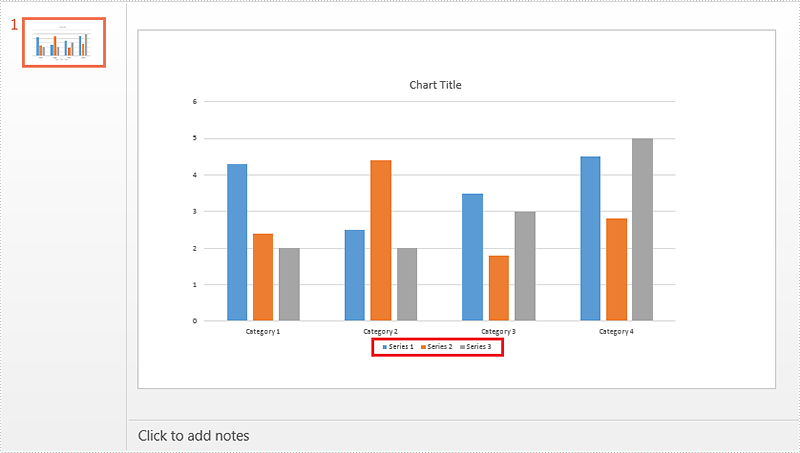
When creating chart, the legend appears by default. If we just need the chart series rather than the legend, we can delete the legend entries after creating the chart. Spire.Presentation supports to delete legend entries from chart by using ChartLegend.DeleteEntry method. This article is going to demonstrate how we can use Spire.Presentation to accomplish this function.
Below screenshot shows the example PowerPoint file which contains 3 chart legend entries:
Detail steps:
Step 1: Initialize an object of Presentation class and load the PowerPoint file.
Presentation ppt = new Presentation();
ppt.LoadFromFile("Input.pptx");
Step 2: Get the chart.
IChart chart = ppt.Slides[0].Shapes[0] as IChart;
Step 3: Delete the first and the second legend entries from the chart.
chart.ChartLegend.DeleteEntry(0);
chart.ChartLegend.DeleteEntry(1);
Step 4: Save the file.
ppt.SaveToFile("Output.pptx", FileFormat.Pptx2010);
Screenshot:
Full code:
using Spire.Presentation;
using Spire.Presentation.Charts;

namespace Delete_chart_legend_entries_in_PPT
{
    class Program
    {
        static void Main(string[] args)
        {
            Presentation ppt = new Presentation();
            ppt.LoadFromFile("Input.pptx");

            IChart chart = ppt.Slides[0].Shapes[0] as IChart;

            chart.ChartLegend.DeleteEntry(0);
            chart.ChartLegend.DeleteEntry(1);

            ppt.SaveToFile("Output.pptx", FileFormat.Pptx2010);
        }
    }
}
Group Two-Level Axis Labels in a Chart in PowerPoint in C#, VB.NET
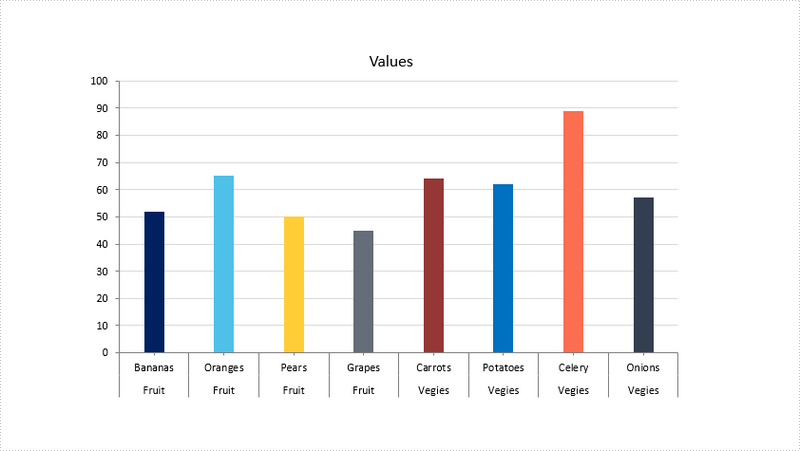
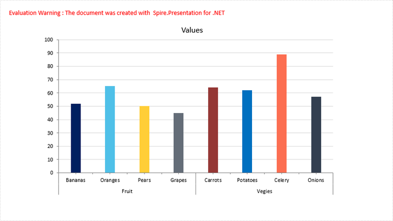
2018-03-07 06:41:56 Written by support iceblueSometimes, you may have a chart that contains two levels of horizontal axis labels, as shown in the following screenshot, and you need to group the labels by fruit and vegies. This article will show you how to group the category axis labels using Spire.Presentation.
Step 1: Create a Presentation instance and load the sample PowerPoint file.
Presentation ppt = new Presentation();
ppt.LoadFromFile("chart.pptx");
Step 2: Get the chart.
IChart chart = ppt.Slides[0].Shapes[0] as IChart;
Step 3: Get the category axis from the chart.
IChartAxis chartAxis = chart.PrimaryCategoryAxis;
Step 4: Determine if the axis has multilevel labels, if yes, group the axis labels that have the same first-level label.
if(chartAxis.HasMultiLvlLbl)
{
    chartAxis.IsMergeSameLabel = true;
}
Step 5: Save the file.
ppt.SaveToFile("result.pptx", FileFormat.Pptx2010);
Output:
Full Code:
using Spire.Presentation;
using Spire.Presentation.Charts;

namespace GroupLabel
{
    class Program
    {
        static void Main(string[] args)
        {
            Presentation ppt = new Presentation();
            ppt.LoadFromFile("chart.pptx");
            IChart chart = ppt.Slides[0].Shapes[0] as IChart;
            IChartAxis chartAxis = chart.PrimaryCategoryAxis;
            if (chartAxis.HasMultiLvlLbl)
            {
                //group labels
                chartAxis.IsMergeSameLabel = true;
            }
            ppt.SaveToFile("result.pptx", FileFormat.Pptx2010);
        }
    }
}
Imports Spire.Presentation
Imports Spire.Presentation.Charts

Namespace GroupLabel
	Class Program
		Private Shared Sub Main(args As String())
			Dim ppt As New Presentation()
			ppt.LoadFromFile("chart.pptx")
			Dim chart As IChart = TryCast(ppt.Slides(0).Shapes(0), IChart)
			Dim chartAxis As IChartAxis = chart.PrimaryCategoryAxis
			If chartAxis.HasMultiLvlLbl Then
				'group labels
				chartAxis.IsMergeSameLabel = True
			End If
			ppt.SaveToFile("result.pptx", FileFormat.Pptx2010)
		End Sub
	End Class
End Namespace
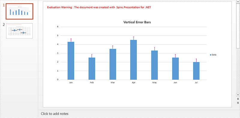
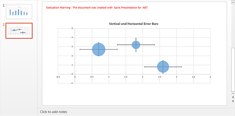
Error bars in charts can help us to see margins of error and standard deviations at a glance. We can use error bars in area, bar, column, line, and XY charts. In XY charts i.e. scatter and bubble charts, we can show X (Horizontal) and Y (Vertical) error bars. However if the chart type is not XY, the error bars for X values are disabled.
This article demonstrates how to add and format error bars for non-XY and XY charts in a PowerPoint document using Spire.Presentation and C#.
Detail steps:
Step 1: Initialize an object of Presentation class and load the PowerPoint document.
Presentation ppt = new Presentation();
ppt.LoadFromFile("Input.pptx");
Step 2: Get the column chart on the first slide and set chart title.
IChart columnChart = ppt.Slides[0].Shapes[0] as IChart;
columnChart.ChartTitle.TextProperties.Text = "Vertical Error Bars";
Step 3: Add Y (Vertical) error bars to the first chart series and format the error bars.
//Get Y error bars of the first chart series
IErrorBarsFormat errorBarsYFormat1 = columnChart.Series[0].ErrorBarsYFormat;
//Set end cap
errorBarsYFormat1.ErrorBarNoEndCap = false;
//Specify direction
errorBarsYFormat1.ErrorBarSimType = ErrorBarSimpleType.Plus;
//Specify error amount type
errorBarsYFormat1.ErrorBarvType = ErrorValueType.StandardError;
//Set value
errorBarsYFormat1.ErrorBarVal = 0.3f;
//Set line format
errorBarsYFormat1.Line.FillType = FillFormatType.Solid;
errorBarsYFormat1.Line.SolidFillColor.Color = Color.MediumVioletRed;
errorBarsYFormat1.Line.Width = 1;
Step 4: Get the bubble chart on the second slide and set chart title.
IChart chart2 = ppt.Slides[1].Shapes[0] as IChart;
chart2.ChartTitle.TextProperties.Text = "Vertical and Horizontal Error Bars";
Step 5: Add x (Horizontal) and Y (Vertical) error bars to the first chart series and format the error bars.
//Get X error bars of the first chart series
IErrorBarsFormat errorBarsXFormat = bubbleChart.Series[0].ErrorBarsXFormat;
//Set end cap
errorBarsXFormat.ErrorBarNoEndCap = false;
//Specify direction
errorBarsXFormat.ErrorBarSimType = ErrorBarSimpleType.Both;

//Specify error amount type
errorBarsXFormat.ErrorBarvType = ErrorValueType.StandardError;
//Set value
errorBarsXFormat.ErrorBarVal = 0.3f;

//Get Y error bars of the first chart series
IErrorBarsFormat errorBarsYFormat2 = bubbleChart.Series[0].ErrorBarsYFormat;
//Set end cap
errorBarsYFormat2.ErrorBarNoEndCap = false;
//Specify direction
errorBarsYFormat2.ErrorBarSimType = ErrorBarSimpleType.Both;
//Specify error amount type
errorBarsYFormat2.ErrorBarvType = ErrorValueType.StandardError;
//Set value
errorBarsYFormat2.ErrorBarVal = 0.3f;
Step 6: Save the document.
ppt.SaveToFile("ErrorBars.pptx", FileFormat.Pptx2013);
Screenshot:
Full code:
using System.Drawing;
using Spire.Presentation;
using Spire.Presentation.Charts;
using Spire.Presentation.Drawing;

namespace Add_error_bars_to_chart_in_PPT
{
    class Program
    {
        static void Main(string[] args)
        {
            //Load the PowerPoint document
            Presentation ppt = new Presentation();
            ppt.LoadFromFile("Input.pptx");

            //Get the column chart on the first slide and set chart title
            IChart columnChart = ppt.Slides[0].Shapes[0] as IChart;
            columnChart.ChartTitle.TextProperties.Text = "Vertical Error Bars";

            //Add Y (Vertical) Error Bars

            //Get Y error bars of the first chart series
            IErrorBarsFormat errorBarsYFormat1 = columnChart.Series[0].ErrorBarsYFormat;
            //Set end cap
            errorBarsYFormat1.ErrorBarNoEndCap = false;
            //Specify direction
            errorBarsYFormat1.ErrorBarSimType = ErrorBarSimpleType.Plus;
            //Specify error amount type
            errorBarsYFormat1.ErrorBarvType = ErrorValueType.StandardError;
            //Set value
            errorBarsYFormat1.ErrorBarVal = 0.3f;
            //Set line format
            errorBarsYFormat1.Line.FillType = FillFormatType.Solid;
            errorBarsYFormat1.Line.SolidFillColor.Color = Color.MediumVioletRed;
            errorBarsYFormat1.Line.Width = 1;

            //Get the bubble chart on the second slide and set chart title
            IChart bubbleChart = ppt.Slides[1].Shapes[0] as IChart;
            bubbleChart.ChartTitle.TextProperties.Text = "Vertical and Horizontal Error Bars";

            //Add X (Horizontal) and Y (Vertical) Error Bars

            //Get X error bars of the first chart series
            IErrorBarsFormat errorBarsXFormat = bubbleChart.Series[0].ErrorBarsXFormat;
            //Set end cap
            errorBarsXFormat.ErrorBarNoEndCap = false;
            //Specify direction
            errorBarsXFormat.ErrorBarSimType = ErrorBarSimpleType.Both;
            //Specify error amount type
            errorBarsXFormat.ErrorBarvType = ErrorValueType.StandardError;
            //Set value
            errorBarsXFormat.ErrorBarVal = 0.3f;

            //Get Y error bars of the first chart series
            IErrorBarsFormat errorBarsYFormat2 = bubbleChart.Series[0].ErrorBarsYFormat;
            //Set end cap
            errorBarsYFormat2.ErrorBarNoEndCap = false;
            //Specify direction
            errorBarsYFormat2.ErrorBarSimType = ErrorBarSimpleType.Both;
            //Specify error amount type
            errorBarsYFormat2.ErrorBarvType = ErrorValueType.StandardError;
            //Set value
            errorBarsYFormat2.ErrorBarVal = 0.3f;

            //Save the document
            ppt.SaveToFile("ErrorBars.pptx", FileFormat.Pptx2013);
        }
    }
}
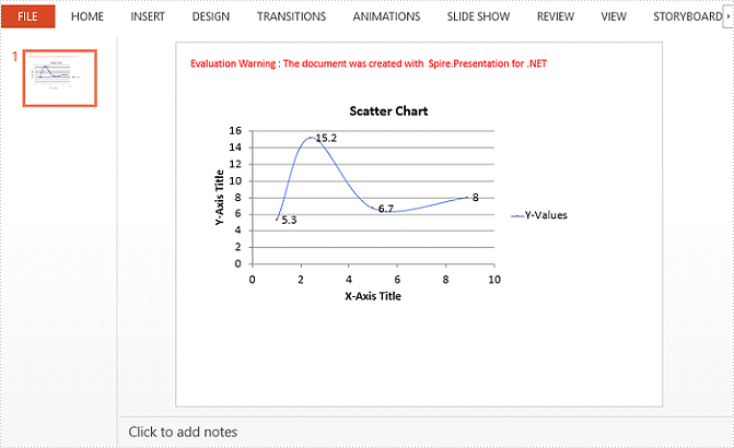
A Scatter (X Y) Chart has two value axes – X value axis and Y value axis. It combines X and Y values into single data points and shows them in irregular intervals, or clusters. This article will show you how to create scatter chart in PowerPoint using Spire.Presentation with C#.
Step 1: Create a Presentation object.
Presentation presentation = new Presentation();
Step 2: Add a "Scatter with Smooth Lines and Markers" chart to the first slide, and set the chart title.
IChart chart = presentation.Slides[0].Shapes.AppendChart(ChartType.ScatterSmoothLinesAndMarkers, new RectangleF(40, 80, 550, 320), false);
chart.ChartTitle.TextProperties.Text = "Scatter Chart";
chart.ChartTitle.TextProperties.IsCentered = true;
chart.ChartTitle.Height = 20;
chart.HasTitle = true;
Step 3: Write data to the chart data.
Double[] xdata = new Double[] { 1.0, 2.4, 5.0, 8.9 };
Double[] ydata = new Double[] { 5.3, 15.2, 6.7, 8 };
chart.ChartData[0, 0].Text = "X-Values";
chart.ChartData[0, 1].Text = "Y-Values";
for (Int32 i = 0; i < xdata.Length; ++i)
{
    chart.ChartData[i + 1, 0].Value = xdata[i];
    chart.ChartData[i + 1, 1].Value = ydata[i];
}
Step 4: Set up the data source of the X values, the Y values, and the series label.
chart.Series.SeriesLabel = chart.ChartData["B1", "B1"];
chart.Series[0].XValues= chart.ChartData["A2", "A5"];
chart.Series[0].YValues = chart.ChartData["B2", "B5"];
Step 5: Add and display the data labels in the chart.
for (int i = 0; i < 4; i++)
{
    ChartDataLabel dataLabel = chart.Series[0].DataLabels.Add();
    dataLabel.LabelValueVisible = true;
}
Step 6: Set the axis titles.
chart.PrimaryValueAxis.HasTitle = true;
chart.PrimaryValueAxis.Title.TextProperties.Text = "X-Axis Title";
chart.SecondaryValueAxis.HasTitle = true;
chart.SecondaryValueAxis.Title.TextProperties.Text = "Y-Axis Title";
Step 7: Format the gridlines.
chart.SecondaryValueAxis.MajorGridTextLines.FillType = FillFormatType.Solid;
chart.SecondaryValueAxis.MajorGridTextLines.Style = TextLineStyle.ThinThin;
chart.SecondaryValueAxis.MajorGridTextLines.SolidFillColor.Color = Color.Gray;
chart.PrimaryValueAxis.MajorGridTextLines.FillType = FillFormatType.None;
Step 8: Format the outline.
chart.Series[0].Line.FillType = FillFormatType.Solid;
chart.Series[0].Line.Width = 0.1f;
chart.Series[0].Line.SolidFillColor.Color = Color.RoyalBlue;
Step 9: Save the file.
presentation.SaveToFile("ScatterChart.pptx", FileFormat.Pptx2010);
Output:
Full Code:
using Spire.Presentation;
using Spire.Presentation.Charts;
using Spire.Presentation.Drawing;
using System;
using System.Drawing;

namespace CreateScatterChart
{
    class Program
    {
        static void Main(string[] args)
        {
            Presentation presentation = new Presentation();
            IChart chart = presentation.Slides[0].Shapes.AppendChart(ChartType.ScatterSmoothLinesAndMarkers, new RectangleF(40, 80, 550, 320), false);
            chart.ChartTitle.TextProperties.Text = "Scatter Chart";
            chart.ChartTitle.TextProperties.IsCentered = true;
            chart.ChartTitle.Height = 20;
            chart.HasTitle = true;

            Double[] xdata = new Double[] { 1.0, 2.4, 5.0, 8.9 };
            Double[] ydata = new Double[] { 5.3, 15.2, 6.7, 8 };
            chart.ChartData[0, 0].Text = "X-Values";
            chart.ChartData[0, 1].Text = "Y-Values";
            for (Int32 i = 0; i < xdata.Length; ++i)
            {
                chart.ChartData[i + 1, 0].Value = xdata[i];
                chart.ChartData[i + 1, 1].Value = ydata[i];
            }

            chart.Series.SeriesLabel = chart.ChartData["B1", "B1"];
            chart.Series[0].XValues = chart.ChartData["A2", "A5"];
            chart.Series[0].YValues = chart.ChartData["B2", "B5"];

            for (int i = 0; i < 4; i++)
            {
                ChartDataLabel dataLabel = chart.Series[0].DataLabels.Add();
                dataLabel.LabelValueVisible = true;
            }

            chart.PrimaryValueAxis.HasTitle = true;
            chart.PrimaryValueAxis.Title.TextProperties.Text = "X-Axis Title";
            chart.SecondaryValueAxis.HasTitle = true;
            chart.SecondaryValueAxis.Title.TextProperties.Text = "Y-Axis Title";

            chart.SecondaryValueAxis.MajorGridTextLines.FillType = FillFormatType.Solid;
            chart.SecondaryValueAxis.MajorGridTextLines.Style = TextLineStyle.ThinThin;
            chart.SecondaryValueAxis.MajorGridTextLines.SolidFillColor.Color = Color.Gray;
            chart.PrimaryValueAxis.MajorGridTextLines.FillType = FillFormatType.None;

            chart.Series[0].Line.FillType = FillFormatType.Solid;
            chart.Series[0].Line.Width = 0.1f;
            chart.Series[0].Line.SolidFillColor.Color = Color.RoyalBlue;

            presentation.SaveToFile("ScatterChart.pptx", FileFormat.Pptx2010);
        }
    }
}