A bar chart is a type of graph that represents categorical data using rectangular bars. It is somewhat like a column chart, but with bars that extend horizontally from the Y-axis. The length of each bar corresponds to the value represented by a particular category or group, and changes, trends, or rankings can be quickly identified by comparing the lengths of the bars. In this article, you will learn how to create a clustered or stacked bar chart in Excel in Python using Spire.XLS for Python.
Install Spire.XLS for Python
This scenario requires Spire.XLS for Python and plum-dispatch v1.7.4. They can be easily installed in your Windows through the following pip command.
pip install Spire.XLS
If you are unsure how to install, please refer to this tutorial: How to Install Spire.XLS for Python on Windows
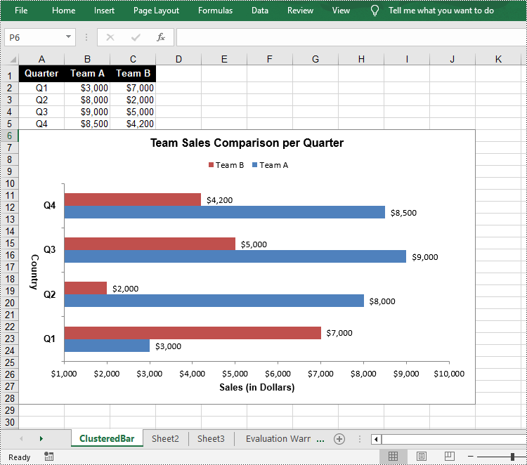
Create a Clustered Bar Chart in Excel in Python
The Worksheet.Chart.Add(ExcelChartType chartType) method provided by Spire.XLS for Python allows to add a chart to a worksheet. To add a clustered bar chart in Excel, you can set the chart type to BarClustered. The following are the steps.
- Create a Workbook object.
- Get a specific worksheet using Workbook.Worksheets[index] property.
- Add chart data to specified cells and set the cell styles.
- Add a clustered bar char to the worksheet using Worksheet.Chart.Add(ExcelChartType.BarClustered) method.
- Set data range for the chart using Chart.DataRange property.
- Set position, title, category axis and value axis for the chart.
- Save the result file using Workbook.SaveToFile() method.
- Python
from spire.common import *
from spire.xls import *

# Create a Workbook instance
workbook = Workbook()

# Get the first sheet and set its name
sheet = workbook.Worksheets[0]
sheet.Name = "ClusteredBar"

# Add chart data to specified cells
sheet.Range["A1"].Value = "Quarter"
sheet.Range["A2"].Value = "Q1"
sheet.Range["A3"].Value = "Q2"
sheet.Range["A4"].Value = "Q3"
sheet.Range["A5"].Value = "Q4"
sheet.Range["B1"].Value = "Team A"
sheet.Range["B2"].NumberValue = 3000
sheet.Range["B3"].NumberValue = 8000
sheet.Range["B4"].NumberValue = 9000
sheet.Range["B5"].NumberValue = 8500
sheet.Range["C1"].Value = "Team B"
sheet.Range["C2"].NumberValue = 7000
sheet.Range["C3"].NumberValue = 2000
sheet.Range["C4"].NumberValue = 5000
sheet.Range["C5"].NumberValue = 4200

# Set cell style
sheet.Range["A1:C1"].RowHeight = 18
sheet.Range["A1:C1"].Style.Color = Color.get_Black()
sheet.Range["A1:C1"].Style.Font.Color = Color.get_White()
sheet.Range["A1:C1"].Style.Font.IsBold = True
sheet.Range["A1:C1"].Style.VerticalAlignment = VerticalAlignType.Center
sheet.Range["A1:C1"].Style.HorizontalAlignment = HorizontalAlignType.Center
sheet.Range["A2:A5"].Style.HorizontalAlignment = HorizontalAlignType.Center
sheet.Range["B2:C5"].Style.NumberFormat = "\"$\"#,##0"

# Add a clustered bar chart to the sheet
chart = sheet.Charts.Add(ExcelChartType.BarClustered)

# Set data range of the chart
chart.DataRange = sheet.Range["A1:C5"]
chart.SeriesDataFromRange = False

# Set position of the chart
chart.LeftColumn = 1
chart.TopRow = 6
chart.RightColumn = 11
chart.BottomRow = 29

# Set and format chart title
chart.ChartTitle = "Team Sales Comparison per Quarter"
chart.ChartTitleArea.IsBold = True
chart.ChartTitleArea.Size = 12

# Set and format category axis
chart.PrimaryCategoryAxis.Title = "Country"
chart.PrimaryCategoryAxis.Font.IsBold = True
chart.PrimaryCategoryAxis.TitleArea.IsBold = True
chart.PrimaryCategoryAxis.TitleArea.TextRotationAngle = 90

# Set and format value axis
chart.PrimaryValueAxis.Title = "Sales (in Dollars)"
chart.PrimaryValueAxis.HasMajorGridLines = False
chart.PrimaryValueAxis.MinValue = 1000
chart.PrimaryValueAxis.TitleArea.IsBold = True

# Show data labels for data points
for cs in chart.Series:
    cs.Format.Options.IsVaryColor = True
    cs.DataPoints.DefaultDataPoint.DataLabels.HasValue = True

# Set legend position
chart.Legend.Position = LegendPositionType.Top

#Save the result file
workbook.SaveToFile("ClusteredBarChart.xlsx", ExcelVersion.Version2016)
workbook.Dispose()
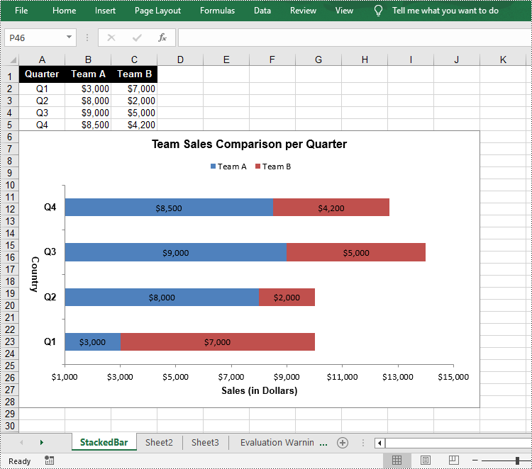
Create a Stacked Bar Chart in Excel in Python
To create a stacked bar chart, you just need to change the Excel chart type to BarStacked. The following are the steps.
- Create a Workbook object.
- Get a specific worksheet using Workbook.Worksheets[index] property.
- Add chart data to specified cells and set the cell styles.
- Add a clustered bar char to the worksheet using Worksheet.Chart.Add(ExcelChartType.BarStacked) method.
- Set data range for the chart using Chart.DataRange property.
- Set position, title, category axis and value axis for the chart.
- Save the result file using Workbook.SaveToFile() method.
- Python
from spire.common import *
from spire.xls import *

# Create a Workbook instance
workbook = Workbook()

# Get the first sheet and set its name
sheet = workbook.Worksheets[0]
sheet.Name = "StackedBar"

# Add chart data to specified cells
sheet.Range["A1"].Value = "Quarter"
sheet.Range["A2"].Value = "Q1"
sheet.Range["A3"].Value = "Q2"
sheet.Range["A4"].Value = "Q3"
sheet.Range["A5"].Value = "Q4"
sheet.Range["B1"].Value = "Team A"
sheet.Range["B2"].NumberValue = 3000
sheet.Range["B3"].NumberValue = 8000
sheet.Range["B4"].NumberValue = 9000
sheet.Range["B5"].NumberValue = 8500
sheet.Range["C1"].Value = "Team B"
sheet.Range["C2"].NumberValue = 7000
sheet.Range["C3"].NumberValue = 2000
sheet.Range["C4"].NumberValue = 5000
sheet.Range["C5"].NumberValue = 4200

# Set cell style
sheet.Range["A1:C1"].RowHeight = 18
sheet.Range["A1:C1"].Style.Color = Color.get_Black()
sheet.Range["A1:C1"].Style.Font.Color = Color.get_White()
sheet.Range["A1:C1"].Style.Font.IsBold = True
sheet.Range["A1:C1"].Style.VerticalAlignment = VerticalAlignType.Center
sheet.Range["A1:C1"].Style.HorizontalAlignment = HorizontalAlignType.Center
sheet.Range["A2:A5"].Style.HorizontalAlignment = HorizontalAlignType.Center
sheet.Range["B2:C5"].Style.NumberFormat = "\"$\"#,##0"

# Add a clustered bar chart to the sheet
chart = sheet.Charts.Add(ExcelChartType.BarStacked)

# Set data range of the chart
chart.DataRange = sheet.Range["A1:C5"]
chart.SeriesDataFromRange = False

# Set position of the chart
chart.LeftColumn = 1
chart.TopRow = 6
chart.RightColumn = 11
chart.BottomRow = 29

# Set and format chart title
chart.ChartTitle = "Team Sales Comparison per Quarter"
chart.ChartTitleArea.IsBold = True
chart.ChartTitleArea.Size = 12

# Set and format category axis
chart.PrimaryCategoryAxis.Title = "Country"
chart.PrimaryCategoryAxis.Font.IsBold = True
chart.PrimaryCategoryAxis.TitleArea.IsBold = True
chart.PrimaryCategoryAxis.TitleArea.TextRotationAngle = 90

# Set and format value axis
chart.PrimaryValueAxis.Title = "Sales (in Dollars)"
chart.PrimaryValueAxis.HasMajorGridLines = False
chart.PrimaryValueAxis.MinValue = 1000
chart.PrimaryValueAxis.TitleArea.IsBold = True

# Show data labels for data points
for cs in chart.Series:
    cs.Format.Options.IsVaryColor = True
    cs.DataPoints.DefaultDataPoint.DataLabels.HasValue = True

# Set legend position
chart.Legend.Position = LegendPositionType.Top

#Save the result file
workbook.SaveToFile("StackedBarChart.xlsx", ExcelVersion.Version2016)
workbook.Dispose()
Apply for a Temporary License
If you'd like to remove the evaluation message from the generated documents, or to get rid of the function limitations, please request a 30-day trial license for yourself.