A clustered column chart and a stacked column chart are two variants of column chart. The clustered column chart enables straightforward comparison of values across different categories, while the stacked column chart displays both the total for each category and the proportion of its individual components. In this article, you will learn how to create clustered or stacked column charts in Excel in Python using Spire.XLS for Python.
Install Spire.XLS for Python
This scenario requires Spire.XLS for Python and plum-dispatch v1.7.4. They can be easily installed in your Windows through the following pip command.
pip install Spire.XLS
If you are unsure how to install, please refer to this tutorial: How to Install Spire.XLS for Python on Windows
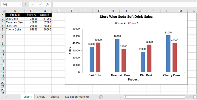
Create a Clustered Column Chart in Excel in Python
To add a chart to a worksheet, use Worksheet.Chart.Add(ExcelChartType chartType) method. The ExcelChartType enumeration includes various chart types predefined in MS Excel. The following are the steps to add a clustered column chart in Excel using Spire.XLS for Python.
- Create a Workbook object.
- Get a specific worksheet through Workbook.Worksheets[index] property.
- Write data into the specified cells.
- Add a clustered column char to the worksheet using Worksheet.Chart.Add(ExcelChartType.ColumnClustered) method.
- Set the chart data through Chart.DataRange property.
- Set the position, title, and other attributes of the chart through the properties under the Chart object.
- Save the workbook to an Excel file using Workbook.SaveToFile() method.
- Python
from spire.xls import *
from spire.xls.common import *

# Create a Workbook object
workbook = Workbook()

# Get the first sheet
sheet = workbook.Worksheets[0]

# Set chart data
sheet.Range["A1"].Value = "Product"
sheet.Range["A2"].Value = "Diet Coke"
sheet.Range["A3"].Value = "Mountain Dew"
sheet.Range["A4"].Value = "Diet Pesi"
sheet.Range["A5"].Value = "Cherry Coke"

sheet.Range["B1"].Value = "Store A"
sheet.Range["B2"].NumberValue = 35000
sheet.Range["B3"].NumberValue = 46000
sheet.Range["B4"].NumberValue = 28000
sheet.Range["B5"].NumberValue = 51000
sheet.Range["C1"].Value = "Store B"
sheet.Range["C2"].NumberValue = 41000
sheet.Range["C3"].NumberValue = 32000
sheet.Range["C4"].NumberValue = 38000
sheet.Range["C5"].NumberValue = 40000

# Set cell style
sheet.Range["A1:C1"].RowHeight = 15
sheet.Range["A1:C1"].Style.Color = Color.get_Black()
sheet.Range["A1:C1"].Style.Font.Color = Color.get_White()
sheet.Range["A1:C1"].Style.VerticalAlignment = VerticalAlignType.Center
sheet.Range["A1:C1"].Style.HorizontalAlignment = HorizontalAlignType.Center
sheet.AutoFitColumn(1)

# Add a chart to the sheet
chart = sheet.Charts.Add(ExcelChartType.ColumnClustered)

# Set data range of chart
chart.DataRange = sheet.Range["A1:C5"]
chart.SeriesDataFromRange = False

# Set position of the chart
chart.LeftColumn = 5
chart.TopRow = 1
chart.RightColumn = 14
chart.BottomRow = 21

# Set chart title
chart.ChartTitle = "Store Wise Soda Soft Drink Sales"
chart.ChartTitleArea.IsBold = True
chart.ChartTitleArea.Size = 12

# Set axis title
chart.PrimaryCategoryAxis.Title = "Product"
chart.PrimaryCategoryAxis.Font.IsBold = True
chart.PrimaryCategoryAxis.TitleArea.IsBold = True
chart.PrimaryValueAxis.Title = "Sales"
chart.PrimaryValueAxis.HasMajorGridLines = False
chart.PrimaryValueAxis.TitleArea.IsBold = True
chart.PrimaryValueAxis.TitleArea.TextRotationAngle = 90

# Set series color, overlap, gap width and data labels
series = chart.Series
for i in range(len(series)):
    cs = series[i]
    cs.Format.Options.IsVaryColor = True
    cs.Format.Options.Overlap = -50
    cs.Format.Options.GapWidth = 350
    cs.DataPoints.DefaultDataPoint.DataLabels.HasValue = True

# Set legend position
chart.Legend.Position = LegendPositionType.Top

# Save the document
workbook.SaveToFile("ClusteredColumnChart.xlsx", ExcelVersion.Version2016)
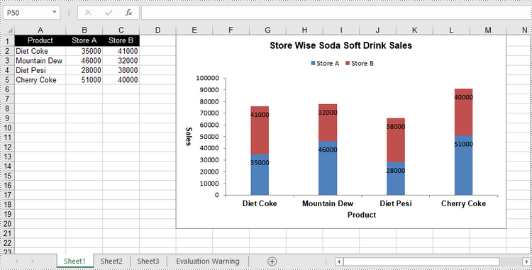
Create a Stacked Column Chart in Excel in Python
The process of creating a stacked column chart is similar to that of creating a clustered column chart. The only difference is that you must change the Excel chart type from ColumnClustered to ColumnStacked.
- Create a Workbook object.
- Get a specific worksheet through Workbook.Worksheets[index] property.
- Write data into the specified cells.
- Add a clustered column char to the worksheet using Worksheet.Chart.Add(ExcelChartType.ColumnStacked) method.
- Set the chart data through Chart.DataRange property.
- Set the position, title, and other attributes of the chart through the properties under the Chart object.
- Save the workbook to an Excel file using Workbook.SaveToFile() method.
- Python
from spire.xls import *
from spire.xls.common import *

# Create a Workbook object
workbook = Workbook()

# Get the first sheet
sheet = workbook.Worksheets[0]

# Set chart data
sheet.Range["A1"].Value = "Product"
sheet.Range["A2"].Value = "Diet Coke"
sheet.Range["A3"].Value = "Mountain Dew"
sheet.Range["A4"].Value = "Diet Pesi"
sheet.Range["A5"].Value = "Cherry Coke"
sheet.Range["B1"].Value = "Store A"
sheet.Range["B2"].NumberValue = 35000
sheet.Range["B3"].NumberValue = 46000
sheet.Range["B4"].NumberValue = 28000
sheet.Range["B5"].NumberValue = 51000
sheet.Range["C1"].Value = "Store B"
sheet.Range["C2"].NumberValue = 41000
sheet.Range["C3"].NumberValue = 32000
sheet.Range["C4"].NumberValue = 38000
sheet.Range["C5"].NumberValue = 40000

# Set cell style
sheet.Range["A1:C1"].RowHeight = 15
sheet.Range["A1:C1"].Style.Color = Color.get_Black()
sheet.Range["A1:C1"].Style.Font.Color = Color.get_White()
sheet.Range["A1:C1"].Style.VerticalAlignment = VerticalAlignType.Center
sheet.Range["A1:C1"].Style.HorizontalAlignment = HorizontalAlignType.Center
sheet.AutoFitColumn(1)

# Add a chart to the sheet
chart = sheet.Charts.Add(ExcelChartType.ColumnStacked)

# Set data range of chart
chart.DataRange = sheet.Range["A1:C5"]
chart.SeriesDataFromRange = False

# Set position of the chart
chart.LeftColumn = 5
chart.TopRow = 1
chart.RightColumn = 14
chart.BottomRow = 21

# Set chart title
chart.ChartTitle = "Store Wise Soda Soft Drink Sales"
chart.ChartTitleArea.IsBold = True
chart.ChartTitleArea.Size = 12

# Set axis title
chart.PrimaryCategoryAxis.Title = "Product"
chart.PrimaryCategoryAxis.Font.IsBold = True
chart.PrimaryCategoryAxis.TitleArea.IsBold = True
chart.PrimaryValueAxis.Title = "Sales"
chart.PrimaryValueAxis.HasMajorGridLines = False
chart.PrimaryValueAxis.TitleArea.IsBold = True
chart.PrimaryValueAxis.TitleArea.TextRotationAngle = 90

# Set series color, gap width and data labels
series = chart.Series
for i in range(len(series)):
    cs = series[i]
    cs.Format.Options.IsVaryColor = True
    cs.Format.Options.GapWidth = 270
    cs.DataPoints.DefaultDataPoint.DataLabels.HasValue = True
    cs.DataPoints.DefaultDataPoint.DataLabels.Position = DataLabelPositionType.Inside

# Set legend position
chart.Legend.Position = LegendPositionType.Top

# Save the document
workbook.SaveToFile("StackedColumnChart.xlsx", ExcelVersion.Version2016)
Apply for a Temporary License
If you'd like to remove the evaluation message from the generated documents, or to get rid of the function limitations, please request a 30-day trial license for yourself.