Pivot charts are a powerful tool in Excel that allows you to visualize data from pivot tables in an easy-to-understand format. They enable users to summarize large datasets, highlight trends, and make data-driven decisions through interactive graphs. Whether you're analyzing sales figures, performance metrics, or any other form of data, pivot charts provide a dynamic way to represent complex data visually. In this article, we will demonstrate how to create pivot charts in Excel in Python using Spire.XLS for Python.
- Create Pivot Charts in Excel in Python
- Show or Hide Field Buttons in Pivot Charts in Excel in Python
- Format Pivot Chart Series in Excel in Python
Install Spire.XLS for Python
This scenario requires Spire.XLS for Python and plum-dispatch v1.7.4. They can be easily installed in your Windows through the following pip command.
pip install Spire.XLS
If you are unsure how to install, please refer to this tutorial: How to Install Spire.XLS for Python on Windows
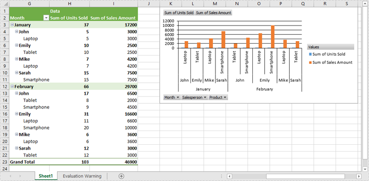
Create Pivot Charts in Excel in Python
Spire.XLS for Python provides the Worksheet.Charts.Add(pivotChartType:ExcelChartType, pivotTable:IPivotTable) method to create a pivot chart based on a specific pivot table in Excel. The detailed steps are as follows:
- Create an object of the Workbook class.
- Load an Excel file using Workbook.LoadFromFile() method.
- Get a specific worksheet in the Excel file using Workbook.Worksheets[index] property.
- Get a specific pivot table in the worksheet using Worksheet.PivotTables[index] property.
- Add a pivot chart based on the pivot table to the worksheet using Worksheet.Charts.Add(pivotChartType:ExcelChartType, pivotTable:IPivotTable) method.
- Set the position and title of the pivot chart.
- Save the resulting file using Workbook.SaveToFile() method.
- Python
from spire.xls import *
from spire.xls.common import *

# Create a Workbook object
workbook = Workbook()
# Load an Excel file
workbook.LoadFromFile("PivotTable.xlsx")

# Get the first worksheet
sheet = workbook.Worksheets[0]

# Get the first pivot table in the worksheet
pivotTable = sheet.PivotTables[0]

# Create a clustered column chart based on the pivot table
pivotChart = sheet.Charts.Add(ExcelChartType.ColumnClustered, pivotTable)
# Set chart position
pivotChart.TopRow = 1
pivotChart.LeftColumn = 11
pivotChart.RightColumn = 20
pivotChart.BottomRow = 15

# Set chart title to null
pivotChart.ChartTitle = ""

# Save the resulting file
workbook.SaveToFile("CreatePivotChart.xlsx", ExcelVersion.Version2013)
workbook.Dispose()
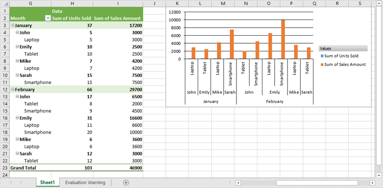
Show or Hide Field Buttons in Pivot Charts in Excel in Python
You can show or hide the following field buttons in a pivot chart with Spire.XLS for Python:
- Entire Field Buttons
- Report Filter Field Buttons
- Legend Field Buttons
- Axis Field Buttons
- Value Field Buttons
The detailed steps are as follows:
- Create an object of the Workbook class.
- Load an Excel file using Workbook.LoadFromFile() method.
- Get a specific worksheet in the Excel file using Workbook.Worksheets[index] property.
- Get a specific pivot table in the worksheet using Worksheet.PivotTables[index] property.
- Add a pivot chart based on the pivot table to the worksheet using Worksheet.Charts.Add(pivotChartType:ExcelChartType, pivotTable:IPivotTable) method.
- Set the position and title of the pivot chart.
- Hide specific field buttons in the pivot chart, such as the axis field buttons and the value field buttons, using Chart.DisplayAxisFieldButtons and Chart.DisplayValueFieldButtons properties.
- Save the resulting file using Workbook.SaveToFile() method.
- Python
from spire.xls import *
from spire.xls.common import *

# Create a Workbook object
workbook = Workbook()
# Load an Excel file
workbook.LoadFromFile("CreatePivotChart.xlsx")

# Get the first worksheet
sheet = workbook.Worksheets[0]

# Get the first pivot table in the worksheet
pivotTable = sheet.PivotTables[0]

# Create a clustered column chart based on the pivot table
pivotChart = sheet.Charts.Add(ExcelChartType.ColumnClustered, pivotTable)
# Set chart position
pivotChart.TopRow = 1
pivotChart.LeftColumn = 11
pivotChart.RightColumn = 20
pivotChart.BottomRow = 15

# Set chart title to null
pivotChart.ChartTitle = ""

# Hide specific field buttons
pivotChart.DisplayAxisFieldButtons = False
pivotChart.DisplayValueFieldButtons = False
# pivotChart.DisplayLegendFieldButtons = False
# pivotChart.ShowReportFilterFieldButtons = False
# pivotChart.DisplayEntireFieldButtons = False

# Save the resulting file
workbook.SaveToFile("HideFieldButtons.xlsx", ExcelVersion.Version2013)
workbook.Dispose()
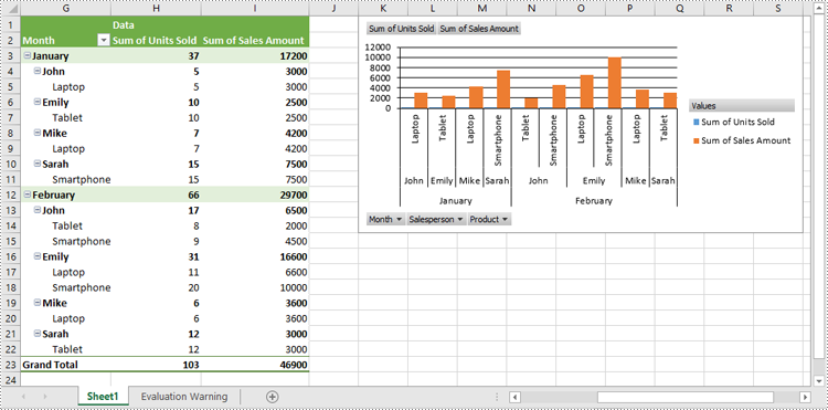
Format Pivot Chart Series in Excel in Python
When generating a pivot chart using a pivot table as the data source with Spire.XLS for Python, the chart series are not automatically created. You need to add the series to the pivot chart and then apply the desired formatting. The detailed steps are as follows.
- Create an object of the Workbook class.
- Load an Excel file using Workbook.LoadFromFile() method.
- Get a specific worksheet in the Excel file using Workbook.Worksheets[index] property.
- Get a specific pivot table in the worksheet using Worksheet.PivotTables[index] property.
- Add a pivot chart based on the pivot table to the worksheet using Worksheet.Charts.Add(pivotChartType:ExcelChartType, pivotTable:IPivotTable) method.
- Set the position and title of the pivot chart.
- Add series to the chart using Chart.Series.Add() method and then apply the desired formatting to the series.
- Save the resulting file using Workbook.SaveToFile() method.
- Python
from spire.xls import *
from spire.xls.common import *

# Create a Workbook object
workbook = Workbook()
# Load an Excel file
workbook.LoadFromFile("CreatePivotChart.xlsx")

# Get the first worksheet
sheet = workbook.Worksheets[0]

# Get the first pivot table in the worksheet
pivotTable = sheet.PivotTables[0]

# Create a clustered column chart based on the pivot table
pivotChart = sheet.Charts.Add(ExcelChartType.ColumnClustered, pivotTable)
# Set chart position
pivotChart.TopRow = 1
pivotChart.LeftColumn = 11
pivotChart.RightColumn = 20
pivotChart.BottomRow = 15

# Set chart title to null
pivotChart.ChartTitle = ""

# Add chart series
series = pivotChart.Series.Add(ExcelChartType.ColumnClustered)
# Set bar width
series.GetCommonSerieFormat().GapWidth = 10
# Set overlap
# series.GetCommonSerieFormat().Overlap = 100

# Save the resulting file
workbook.SaveToFile("FormatChartSeries.xlsx", ExcelVersion.Version2013)
workbook.Dispose()
Apply for a Temporary License
If you'd like to remove the evaluation message from the generated documents, or to get rid of the function limitations, please request a 30-day trial license for yourself.