
Pie charts and doughnut charts are two popular types of data visualization tools that are widely used to show the proportional distribution of categories within the whole. Both charts can serve as powerful communication aids, allowing viewers to quickly grasp the significance of each component and how it relates to the overall picture.
While pie charts and doughnut charts share many similarities, they also have unique characteristics that make them suitable for different analytical scenarios. In this article, you will learn how to create a pie chart or a doughnut chart in PowerPoint with Python using Spire.Presentation for Python.
Install Spire.Presentation for Python
This scenario requires Spire.Presentation for Python and plum-dispatch v1.7.4. They can be easily installed in your Windows through the following pip command.
pip install Spire.Presentation
If you are unsure how to install, please refer to this tutorial: How to Install Spire.Presentation for Python on Windows
Create a Pie Chart in PowerPoint with Python
Pie charts are designed to resemble a circle, which is divided into sections or "slices", with each slice representing a portion of the whole.
With Spire.Prensetion for Python, you can add a pie chart to a presentation slide using the ISlide.Shapes.AppendChartInit(type: ChartType, rectangle: RectangleF, init: bool) method and specify the chart type as Pie. The following are the detailed steps.
- Create a Presentation instance.
- Get the first slide using Prenstion.Slides[] property.
- Add a pie chart at a specified location on the side using ISlide.Shapes.AppendChartInit(type: ChartType, rectangle RectangleF, init bool).
- Set and format the chart title.
- Define some data and append the data to the chart sheet as chart data using IChart.ChartData property.
- Set series labels, category labels, series values and other attributes using the properties of the IChart class.
- Set to show label value and percentage value.
- Save the result file using Presentation.SaveToFile() method.
- Python
from spire.presentation.common import *
from spire.presentation import *
# Create a Presentation instance
presentation = Presentation()
# Add a pie chart at a specified location on the first slide
rect = RectangleF.FromLTRB (40, 100, 590, 420)
chart = presentation.Slides[0].Shapes.AppendChartInit (ChartType.Pie, rect, False)
# Set and format chart title
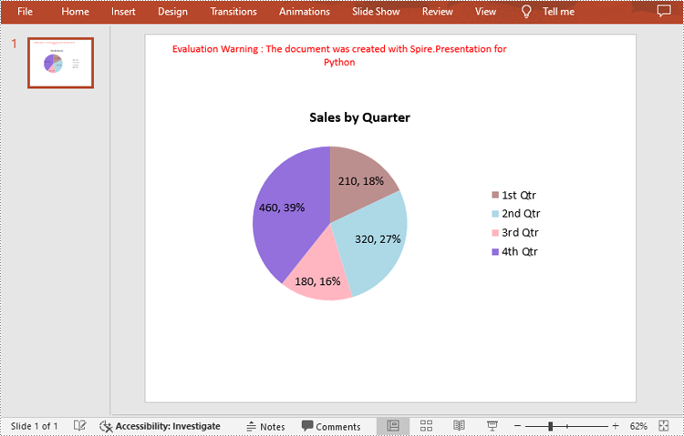
chart.ChartTitle.TextProperties.Text = "Sales by Quarter"
chart.ChartTitle.TextProperties.IsCentered = True
chart.ChartTitle.Height = 30
chart.HasTitle = True
# Define some data
quarters = ["1st Qtr", "2nd Qtr", "3rd Qtr", "4th Qtr"]
sales = [210, 320, 180, 460]
# Append data to ChartData, which represents a data table where the chart data is stored
chart.ChartData[0,0].Text = "Quarters"
chart.ChartData[0,1].Text = "Sales"
i = 0
while i < len(quarters):
chart.ChartData[i + 1,0].Text = quarters[i]
chart.ChartData[i + 1,1].NumberValue = sales[i]
i += 1
# Set series labels and category labels
chart.Series.SeriesLabel = chart.ChartData["B1","B1"]
chart.Categories.CategoryLabels = chart.ChartData["A2","A5"]
# Set values for series
chart.Series[0].Values = chart.ChartData["B2","B5"]
# Add data points to series
for i, unusedItem in enumerate(chart.Series[0].Values):
cdp = ChartDataPoint(chart.Series[0])
cdp.Index = i
chart.Series[0].DataPoints.Add(cdp)
# Fill each data point with a different color
chart.Series[0].DataPoints[0].Fill.FillType = FillFormatType.Solid
chart.Series[0].DataPoints[0].Fill.SolidColor.Color = Color.get_RosyBrown()
chart.Series[0].DataPoints[1].Fill.FillType = FillFormatType.Solid
chart.Series[0].DataPoints[1].Fill.SolidColor.Color = Color.get_LightBlue()
chart.Series[0].DataPoints[2].Fill.FillType = FillFormatType.Solid
chart.Series[0].DataPoints[2].Fill.SolidColor.Color = Color.get_LightPink()
chart.Series[0].DataPoints[3].Fill.FillType = FillFormatType.Solid
chart.Series[0].DataPoints[3].Fill.SolidColor.Color = Color.get_MediumPurple()
# Set the data labels to display label value and percentage value
chart.Series[0].DataLabels.LabelValueVisible = True
chart.Series[0].DataLabels.PercentValueVisible = True
# Save the result file
presentation.SaveToFile("CreatePieChart.pptx", FileFormat.Pptx2016)
presentation.Dispose()
Create a Doughnut Chart in PowerPoint with Python
Doughnut charts are very similar to pie charts, with the primary difference being the presence of a "hole" in the center. This hole can be used to display additional information or to maintain a cleaner look.
To add a donut chart to a presentation slide, you can specify the ChartType parameter of ISlide.Shapes.AppendChartInit() method as Doughnut. The following are the detailed steps.
- Create a Presentation instance.
- Get the first slide using Prenstion.Slides[] property.
- Add a doughnut chart at a specified location on the side using ISlide.Shapes.AppendChartInit(type: ChartType, rectangle: RectangleF, init: bool).
- Define some data and append the data to the chart sheet as chart data using IChart.ChartData property.
- Set series labels, category labels, series values and other attributes using the properties of the IChart class.
- Set to show label value and percentage value.
- Save the result file using Presentation.SaveToFile() method.
- Python
from spire.presentation.common import *
from spire.presentation import *
# Create a Presentation instance
presentation = Presentation()
# Add a doughnut chart at a specified location on the first slide
rect = RectangleF.FromLTRB (80, 100, 630, 420)
chart = presentation.Slides[0].Shapes.AppendChartInit(ChartType.Doughnut, rect, False)
# Set and format chart title
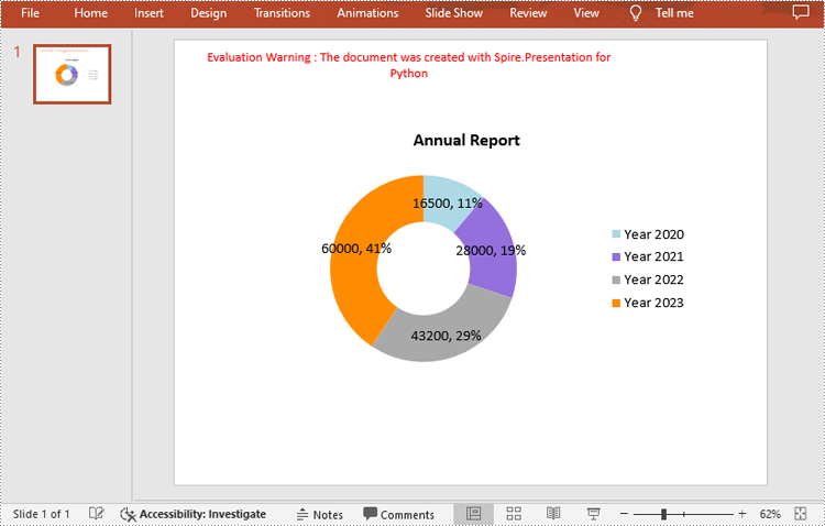
chart.ChartTitle.TextProperties.Text = "Annual Report"
chart.ChartTitle.TextProperties.IsCentered = True
chart.ChartTitle.Height = 30
# Define some data
years = ["Year 2020", "Year 2021", "Year 2022", "Year 2023"]
sales = [16500, 28000, 43200, 60000]
# Append data to ChartData, which represents a data table where the chart data is stored
chart.ChartData[0,0].Text = "Quarters"
chart.ChartData[0,1].Text = "Sales"
i = 0
while i < len(years):
chart.ChartData[i + 1,0].Text = years[i]
chart.ChartData[i + 1,1].NumberValue = sales[i]
i += 1
# Set series labels and category labels
chart.Series.SeriesLabel = chart.ChartData["B1","B1"]
chart.Categories.CategoryLabels = chart.ChartData["A2","A5"]
# Set values for series
chart.Series[0].Values = chart.ChartData["B2","B5"]
# Add data points to series
for i, item in enumerate(chart.Series[0].Values):
cdp = ChartDataPoint(chart.Series[0])
cdp.Index = i
chart.Series[0].DataPoints.Add(cdp)
# Fill each data point with a different color
chart.Series[0].DataPoints[0].Fill.FillType = FillFormatType.Solid
chart.Series[0].DataPoints[0].Fill.SolidColor.Color = Color.get_LightBlue()
chart.Series[0].DataPoints[1].Fill.FillType = FillFormatType.Solid
chart.Series[0].DataPoints[1].Fill.SolidColor.Color = Color.get_MediumPurple()
chart.Series[0].DataPoints[2].Fill.FillType = FillFormatType.Solid
chart.Series[0].DataPoints[2].Fill.SolidColor.Color = Color.get_DarkGray()
chart.Series[0].DataPoints[3].Fill.FillType = FillFormatType.Solid
chart.Series[0].DataPoints[3].Fill.SolidColor.Color = Color.get_DarkOrange()
# Set the data labels to display label value and percentage value
chart.Series[0].DataLabels.LabelValueVisible = True
chart.Series[0].DataLabels.PercentValueVisible = True
# Set the hole size of the doughnut chart
chart.Series[0].DoughnutHoleSize = 50
# Save the result file
presentation.SaveToFile("DoughnutChart.pptx", FileFormat.Pptx2016)
presentation.Dispose()
Apply for a Temporary License
If you'd like to remove the evaluation message from the generated documents, or to get rid of the function limitations, please request a 30-day trial license for yourself.
