
A column chart in PowerPoint is a graphical representation of data that uses bars or columns to show comparisons between categories. It is commonly used to display financial data, statistics, and other quantitative information. Each column represents a category, and the height of the column corresponds to the value associated with that category. Column charts are easy to create and customize within PowerPoint, allowing users to quickly visualize their data.
In this article, you will learn how to programmatically create column charts in a PowerPoint document using Spire.Presentation for Python.
- Create a Clustered Column Chart in PowerPoint in Python
- Create a Stacked Column Chart in PowerPoint in Python
Install Spire.Presentation for Python
This scenario requires Spire.Presentation for Python and plum-dispatch v1.7.4. They can be easily installed in your Windows through the following pip command.
pip install Spire.Presentation
If you are unsure how to install, please refer to this tutorial: How to Install Spire.Presentation for Python on Windows
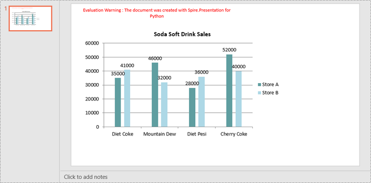
Create a Clustered Column Chart in PowerPoint in Python
A clustered column chart is a type of bar graph where the bars (or columns) are grouped together in clusters or segments, with each cluster representing a category and the height of the columns within the cluster reflecting the value of a data point for that category.
To add a clustered column chart in PowerPoint using Spire.Prensetion for Python, you can use the ISlide.Shapes.AppendChartInit(type: ChartType, rectangle RectangleF, init bool) method and specify the chart type as ColumnClustered. This method returns an object of IChart class, which you can use to set the chart data, title, series labels, category labels, series values and other attributes.
The following are the steps to create a clustered column chart in PowerPoint in Python.
- Create a Presentation object.
- Get the first slide using Prenstion.Slides[] property.
- Add a clustered column chart to the side using ISlide.Shapes.AppendChartInit(type: ChartType, rectangle RectangleF, init bool).
- Add text and numbers to the chart sheet as chart data using IChart.ChartData property.
- Set series labels, category labels, series values and other attributes using the properties of the IChart class.
- Save the document to a PowerPoint file using Presentation.SaveToFile() method.
- Python
from spire.presentation.common import *
from spire.presentation import *

# Create a Presentation object
presentation = Presentation()

# Set slide size type
presentation.SlideSize.Type = SlideSizeType.Screen16x9

# Get the first slide
slide = presentation.Slides[0]

# Add clustered column chart
rect = RectangleF.FromLTRB(40, 80, 700, 450)
chart = slide.Shapes.AppendChartInit(ChartType.ColumnClustered, rect, False)

# Set chart title
chart.ChartTitle.TextProperties.Text = "Soda Soft Drink Sales"
chart.ChartTitle.TextProperties.IsCentered = True
chart.ChartTitle.Height = 25
chart.HasTitle = True

# Insert text to chart as series labels
chart.ChartData[0,0].Text = "Product"
chart.ChartData[0,1].Text = "Store A"
chart.ChartData[0,2].Text = "Store B"

# Insert text to chart as category labels
chart.ChartData[1,0].Text = "Diet Coke"
chart.ChartData[2,0].Text = "Mountain Dew"
chart.ChartData[3,0].Text = "Diet Pesi"
chart.ChartData[4,0].Text = "Cherry Coke"

# Insert numbers to chart as values of series
Series1 = [35000, 46000, 28000, 52000]
Series2 = [41000, 32000, 36000, 40000]
i = 0
while i < len(Series1):
    chart.ChartData[i + 1,1].NumberValue = Series1[i]
    chart.ChartData[i + 1,2].NumberValue = Series2[i]
    i += 1

# Set series labels
chart.Series.SeriesLabel = chart.ChartData["B1","C1"]

# Set category labels
chart.Categories.CategoryLabels = chart.ChartData["A2","A5"]

# Set values for series
chart.Series[0].Values = chart.ChartData["B2","B5"]
chart.Series[1].Values = chart.ChartData["C2","C5"]

# Set gap width
chart.GapWidth = 350

# Set overlap
chart.OverLap = -50

# Set fill color of each series
chart.Series[0].Fill.FillType = FillFormatType.Solid
chart.Series[0].Fill.SolidColor.Color = Color.get_CadetBlue()
chart.Series[1].Fill.FillType = FillFormatType.Solid
chart.Series[1].Fill.SolidColor.Color = Color.get_LightBlue()

# Add data labels
for i in range(len(Series1)):
    chart.Series[0].DataLabels.Add()
    chart.Series[1].DataLabels.Add()

# Save the document
presentation.SaveToFile("output/ClusteredColumnChart.pptx", FileFormat.Pptx2019)
presentation.Dispose()
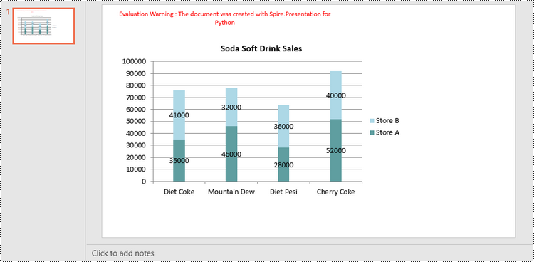
Create a Stacked Column Chart in PowerPoint in Python
A stacked column chart is a variation of the standard column chart where each column represents a category, and the height of the column corresponds to the total value of the category.
To add a stacked column chart in PowerPoint using Spire.Prensetion for Python, you use the ISlide.Shapes.AppendChartInit(type: ChartType, rectangle RectangleF, init bool) method and specify the chart type as ColumnStacked. Then, you can use to set the chart data, title, series labels, category labels, series values and other attributes using the properties of the IChart class.
The following are the steps to create a stacked column chart in PowerPoint in Python.
- Create a Presentation object.
- Get the first slide using Prenstion.Slides[] property.
- Add a stacked column chart to the side using ISlide.Shapes.AppendChartInit(type: ChartType, rectangle RectangleF, init bool).
- Add text and numbers to the chart sheet as chart data using IChart.ChartData property.
- Set series labels, category labels, series values and other attributes using the properties of the IChart class.
- Save the document to a PowerPoint file using Presentation.SaveToFile() method.
- Python
from spire.presentation.common import *
from spire.presentation import *

# Create a Presentation object
presentation = Presentation()

# Set slide size type
presentation.SlideSize.Type = SlideSizeType.Screen16x9

# Get the first slide
slide = presentation.Slides[0]

# Add a stacked column chart
rect = RectangleF.FromLTRB(40, 80, 700, 450)
chart = slide.Shapes.AppendChartInit(ChartType.ColumnStacked, rect, False)

# Set chart title
chart.ChartTitle.TextProperties.Text = "Soda Soft Drink Sales"
chart.ChartTitle.TextProperties.IsCentered = True
chart.ChartTitle.Height = 25
chart.HasTitle = True

# Insert text to chart as series labels
chart.ChartData[0,0].Text = "Product"
chart.ChartData[0,1].Text = "Store A"
chart.ChartData[0,2].Text = "Store B"

# Insert text to chart as category labels
chart.ChartData[1,0].Text = "Diet Coke"
chart.ChartData[2,0].Text = "Mountain Dew"
chart.ChartData[3,0].Text = "Diet Pesi"
chart.ChartData[4,0].Text = "Cherry Coke"

# Insert numbers to chart as values of series
Series1 = [35000, 46000, 28000, 52000]
Series2 = [41000, 32000, 36000, 40000]
i = 0
while i < len(Series1):
    chart.ChartData[i + 1,1].NumberValue = Series1[i]
    chart.ChartData[i + 1,2].NumberValue = Series2[i]
    i += 1

# Set series labels
chart.Series.SeriesLabel = chart.ChartData["B1","C1"]

# Set category labels
chart.Categories.CategoryLabels = chart.ChartData["A2","A5"]

# Set values for series
chart.Series[0].Values = chart.ChartData["B2","B5"]
chart.Series[1].Values = chart.ChartData["C2","C5"]

# Set gap width
chart.GapWidth = 350

# Set fill color of each series
chart.Series[0].Fill.FillType = FillFormatType.Solid
chart.Series[0].Fill.SolidColor.Color = Color.get_CadetBlue()
chart.Series[1].Fill.FillType = FillFormatType.Solid
chart.Series[1].Fill.SolidColor.Color = Color.get_LightBlue()

# Add data labels
for i in range(len(Series1)):
    chart.Series[0].DataLabels.Add()
    chart.Series[1].DataLabels.Add()

# Save the document
presentation.SaveToFile("output/StackedColumnChart.pptx", FileFormat.Pptx2019)
presentation.Dispose()
Apply for a Temporary License
If you'd like to remove the evaluation message from the generated documents, or to get rid of the function limitations, please request a 30-day trial license for yourself.
